Wednesday, December 3, 2008

Water Chandelier

This was the result of 3+ weeks of work.

Photobucket

To me, he looks more like a gallery installation then a chandelier meant for dinnerware, but I'm pleased with how he turned out. Our group worked incredibly hard and spent a lot of hours piecing the bottle together. Thankfully it is done for Project Water!

Tuesday, November 25, 2008

Bitch Magazine Intern app

Bitch Magazine was recently seeking an intern.

I may not be as experienced with illustration and InDesign (I actually only just have worked with them in class since... early October), I decided to give the application a shot.

Whether or not I get called back (chances are slim considering my lack of experience), the project was fun and I learned a few things.

I decided to design my own Bitch magazine and mailed in the application.

For the cover, I got my friends to do a fashion shoot with me where I had them pose in different directions.


After that, I brought it back hope and upped the levels, brightness, and crispness of the picture on photoshop. I also manipulated the colors so I had a nice relationship between warm and cool, Reds and Greens.

I proceeded to work with illustrator using the image as the cover. I couldn't find the Bitch Magazine's font, so I manipulated the font that was closest to it so it looked similar.

And there you have it. :)

Photoshop Portrait

Photoshop Portrait progress from Art with Luke, 120.

First, I clicked a quick picture of myself on my computer's webcam in my kitchen.


Then, I proceeded to create multiple layers on Photoshop, using my picture as the background template. For my hair, I googled multiple images of Ocean waves. And for my skin, I chose to use a surf beach.
These two images were the main clips for the pic.


By bumping up the resolution to 300 dpi, it made the images incredibly pixalated but by using layers of pictures with larger resolution, I was able to blend the collage in an aesthetically pleasing manner.

I used the following tools and blending procedures:
Layers
Level adjustments
Burn (layer)
Hard Light (layer)
Soft Light (Layer)
Contrast/Brightness adjustments
Color level adjustments
Smudge tool

The most fun I had with this project was clipping out various waves and fitting them like a puzzle into my picture. For my eye, I used an aquamarine. For my shirt, I used orange coral. For the frame, I used coral (for pattern reasons), and the Beta I found online.

Combining these principles, I decided to put a play on a famous painting - This is not a pipe.

The text, visuals, layers, images, splicing, and pictures all combined created this final piece.


The Beauty of Youth

Beauty of Youth.

Beauty has as many meanings as man has moods.
Beauty is the symbol of symbols.
Beauty reveals everything, because it expresses nothing.
When it shows us itself, it shows us the whole fiery-colored world. - Oscar Wilde on Beauty


Here are the illustrations I did for our Beauty of Youth book in Design with Luke - Art 118.


I combined a magazine advertisement with an illustration I did of a nude woman wearing the chador. Despite faith, religion, personal decision, privacy, etc. we are all sexual beings - even those who appear chaste or modest. We are all sexual beings. The modern, western conventions of beauty and youth can be quickly dismissed by other cultures.


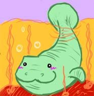
We talked about Oscar Wilde's use of nature when he talked about beauty, so I decided to expand upon nature's relationship with the universe, and our relationship with both. Beautiful universe. Combined a magazine with pen-color illustrations, and chalk-jellyfish.


Che Whatever. A bloody revolutionary. Youth and Beauty is worshipped, even when corrupt. Its a major piece of inspiration. A picture also seems to capture the moment, and its something difficult to forget - even when the figure is replaced by someone else. In many ways, I think it still evokes the same familiar feelings.


A more conventional image of beauty and youth by contrasting a grandmother with her granddaughter.


Dreams. Reflections. Aspirations. Want. Aspects of what makes something beautiful and youthful. The defining principle of these characteristics seems to be one thing - Desire.


Self Portrait. My relationship with youth and beauty is that I can create it if I so choose to. What I see as beautiful and youthful is captured by my pen. So I drew myself as what I perceived to be beauty and youth. Artists have a history of immortalizing themselves as young and beautiful when they are in fact quite old and decrepit.


With every life, another passes away, persistently reminding us that youth and beauty is a fleeting principle. The people that pass away can often tie us to their memories, and the people that we love are often tied as well.


Worship.


Creation and abstraction. Nature synthesized with humanity.

Saturday, October 25, 2008

This isn't an update about art, but about politics.

To think that in barely 11 days, I may see a "black man" become president of the united states is truly and absolutely amazing. I really do love my country. Only 40 years ago, Civil rights ravaged this place, and in only 11 days civil rights helped usher in a man to become a defining president.

I am tremendously excited and in awe that I get to be 22 when I see this day.

I can only pray.

Thursday, October 16, 2008

Week 3 Wednesday Abstract Art

Last time to do three posters! Woohoo. I'm going to rest easy for a while so I can focus on larger projects. I look forward to the upcoming Oscar Wilde book. I'm very excited about illustrating.

Anyways, here are the last two posters.

I decided to take what we learned about design, space, color, and text and try to apply those elements into my usual style of art. That and I was tired of investigating. I just wanted to draw for fun.


This is actually cut out like a comic chat-box, you can see the faint outline. I took the idea from the last drawing I did and implemented it into this. I'll probably keep experimenting with the speech-box and pile of letters. I love the idea and I'm not entirely satisfied with projecting it yet.


Gogol Bordello. DRUM. MICROPHONE. IMMIGRANT PUNK ROCK.


And I leave you with an illustration by my boyfriend. I feel like this right now.


But heeey! Weekend time! I'm going to rest! YAH!!!!!

Week 2 Wednesday Abstract Art

Here's the series from Week 2, Wednesday.

I decided to continue my study of Renaissance and Baroque art by reinterpreting them into a modern context.


This is Artemisia Gentileschi's "Judith slaying Holofernes", one of my favorite paintings.

I picked up some guache and reduced the complex color scheme to four and highlights.


They look like legos murdering someone.

After that, I continued my study of space using as minimum color and shape as I could get by with.

Followers